Thursday, March 18, 2010

Final: Obesity Crisis Pandemic or Endemic


Obesity in United States


An Epidemic or Pandemic?

A Geographical Analysis

For:

Professor Shin

By:

Shayda Haghgoo


Introduction

With the present discussion of the Health Care Bill playing an important role in politics, it seems appropriate to incorporate an analysis regarding one of the most controversial health concerns in America today, obesity. All over the media, “The Obesity Crisis” has made its way as a top story headline in the United States. Allegedly it is one of several problems many Americans face these days, along with the detriments of the recession. As a fellow American Citizen, the media bombards me with documentaries like Super Size Me and Food Inc. regarding the obesity issue, while I end my nights watching Jon Stewart joke about the gluttony of Americans on The Daily Show with Jon Stewart. However, it has come to my attention that the media has described obesity to be both an epidemic and a pandemic, without clear elaboration to which geographic widespread occurrence they really mean. If many Americans all over the US are going through such a crisis, how can an epidemic span across such a wide distance just short of 3000 miles? This analysis is going to geographically evaluate the semantics of pandemic and endemic in context of “The Obesity Crisis.”

Oxford American Dictionary defines epidemic as, “a sudden, widespread occurrence of a particular und going esirable phenomenon,” while delineating pandemic to be, “of a disease prevalent over a whole country or the world."

Obesity, by the Centers for the Disease Control and Prevention (CDC) is defined by a person’s BMI. If an adult possesses a BMI of 25 to 29.9 he is characterized as overweight. If this individual holds a BMI of 30, he is considered obese. Kids and Adolescents' BMI involve individual calculations and results do not have such standards numbers set like adults. Although there are numerous factors, which influence obesity, its primary contributors, follow the Caloric Balance Equation. Presented by the CDC, Associations with the Caloric Balance Equation involve:

· Overweight and obesity result from an energy imbalance. This involves eating too many calories and not getting enough physical activity.

· Body weight is the result of genes, metabolism, behavior, environment, culture, and socioeconomic status.

· Behavior and environment play a large role causing people to be overweight and obese. These are greatest areas for prevention and treatment.

The sample data sets used for this analysis incorporate:

US County Level Estimates of Diagnosed Diabetes in 2007

US County Level Estimates of Obesity in 2007

State Obesity Percentages of Children 2-4 years

School Health Profiles of 2008:

Percentage of Schools that Teach All 12 Physical Activity Topics Including:

· Physical, psychological, or social benefits of physical activity

· Health-related fitness

· Phases of a workout

· How much physical activity is enough

· Developing an individualized physical activity plan

· Monitoring progress toward reaching goals in an individualized physical activity plan

· Overcoming barriers to physical activity

· Decreasing sedentary activities such as television viewings

· Opportunities for physical activity in the community

· Preventing injury during physical activity

· Weather-related safety

· Dangers of using performance-enhancing drugs such as steroids

With a focus on statistics of schools that each decreasing sedentary activities such as television viewings.

I intend to create a geographic analysis on three different samples sets of obesity data in order to confirm my hypothesis that this crisis, is a pandemic spanning across the country influencing Americans from all regions of the United States.

Methods

Data Acquisition

The primary collection of data was entirely contributed by CDC. The acquisition of data was made possible through various publications, links to data trends and provided Excel sheets either hidden deep within their website or right on the front page.

Hot Spot Analysis

According to the Esri ArcMap Website, when conducting the Hot Spot Analysis, a Getis-Ord Gi statistic is computed for each attribute. In figure 1 a Hot Spot Analysis was done of Diabetes Percentages and Obesity Percentages of Adults by County. What is outputted is the Z score. The Z score lets one know whether attributes of high or low values cluster spatially. In order for values to be statistically significant and thus a Hot Spot, a feature will have a high value and surrounded by other features that also have high values. The sum of all features are used as a base for comparison of local sums and its neighbors. A statistically significant Z score results f the local some differs greatly than the expected sum, and the difference is much greater to apply random chance as reasoning.

Z-score and P-score

Z-score is calculated by means of standard deviation. High and low negative Z-scores that also possess very small p-values are located both the upper and lower quartiles. P-values usually indicate a standard error in regards to the outputted Z-score. So if the p-values are very small and there exists very high and very low Z-scores then the random patterned reasoning contributed by the null hypothesis can be rejected.

Central Mean

This tool locates the more centrally located attribute by applying the calculated sum of each feature centroid. The associated the shortest centroid that possesses the least accumulative distance to all other features is selected and created into a new layer with its own feature class.

Choropleth Map

The application of shading, coloring, symbols of various gradients to depict average value of some attribute in those areas. This type of map was applied to data from obesity prevalence among children 2-4 years old by state (figure 2) and the aspects of physical activity taught in school (figure 3)


Results


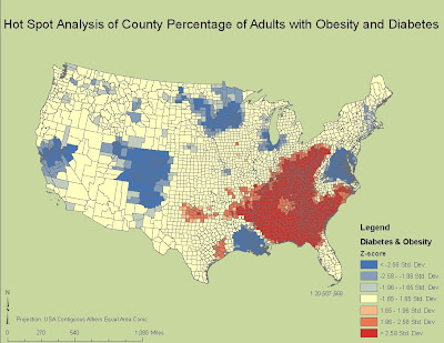
Figure 1. Hotspot Analysis of County Percentage of Adults with Obesity and Diabetes

Figure 2. Average of Obesity Prevalence Among Children 2-4 Years by State

Figure 3. Percentage of Secondary Schools that Teach Physical Activity Topics by State

The results of the Hot Spot Analysis showed that a high positive correlation between diabetes statistics and obesity statistics in the South, and very low correlation in areas like upper-middle California region and the Midwest. The Z-scores for these ‘hot spots’ are found in both the upper and lower quartile regions of the obesity and diabetes data sets. The contributing p-scores range from 0-0.05 in the 95% stating that these clusters hold statistical significance. This means that unlike my hypothesis, there are regions where diabetes and obesity are most prominent such as the South.


The Central Mean Statistical Analysis was done on obesity percentages among kids 2-4 years old. The resulting output indicates the central mean is more or less located in the Illinois region of the country with the point slowly moving toward the west.

Choropleth Map Techniques applied among children 2-4 years old by state show increasing amounts of obesity percentages in each state by graduating shades of one particular hue. Hues included are red, blue and green. Dark regions like California and Texas possess more of the higher percentages out of the data set. The south also shows fairly high percentages of obesity among children.

Choropleth Map Techniques applied in mapping School Health Profiles used symbols particularly circles of a certain color also graduating in hue. The brightness of a hue and the bigger size of the hue indicate a high percentage of schools that teach all 12 physical activity topics and the particular focus on schools that stress teaching decreasing sedentary activities.


Discussion


The Hot Spot Analysis serves as evidence against my hypothesis. There are clear areas where obesity and diabetes percentages are much higher than in others. Furthermore, there are also areas that contain average percentages lower than normal. This analysis provides another area for further questioning. Why is the South so high in percentage? Why are other areas much lower than normal?

The Central Feature shows that the geographical mean of obesity among children is in the Illinois area but the mean is shifting toward the left. One possible explanation could be that although the average of obese kids is located in the Illinois region it will spread much like a disease throughout the country. This analysis is not very accurate, however, since the data used was by state whereas the Hot Spot Analysis used data by County.

The accuracy of data can also be explained for the choropleth map that accompanies the central feature in figure 2. Additionally, it is wise to note California and Texas will have darker shades because they are bigger states with more populations...but because this is based of percentages, the proportion of the states population is represented. Nonetheless, the amount of data used is not enough to provide evidence that this prevalence occurs throughout the state. But by the distribution of the colors there is no specific region like in the Hot Spot that has higher than normal percentages or lower than normal percentages.

The physical activity topics taught in school show that although the Obesity Crisis has environmental influences like watching too much T.V. The education at school throughout the country is not effective since obesity rates among kids are increasing and the highest values of schools that focus on all 12 subjects are in the same region as the above average Hot Spot values in the South.

It is clear now that although among adults, the obesity crisis can be characterized as an epidemic, yet among the health education and percentage of kids who are obese it is becoming a pandemic occurrence, that if gone unsolved will provide detrimental consequences in the US for years to come.


References

Brener ND, McManus T, Foti K, Shanklin SL, Hawkins J, Kann L, Speicher N. School Health Profiles 2008: Characteristics of Health Programs Among Secondary Schools. Atlanta: Centers for Disease Control and Prevention; 2009.


"Diabetes Datas & Trends." Centers for Disease Control and Prevention. Centers for Disease Control and Prevention. Web. 10 Mar. 2010. .


“ArcGIS Desktop Help 9.3” .

Monday, March 8, 2010

Lab#7: Spatial Interpolation

Shayda Haghgoo

Professor Shin

Geography 168


Spatial Interpolation of Seasonal Precipitation in LA County


As LA County is interested in comparing and assessing precipitation for a normal season and a season to date I have made three analyses using three different spatial interpolations, inverse data weighting, spline, and kriging. Spline interpolation involves a special kind of piecewise polynomials, called a spline. The spline is used as the interpolant. The interpolant uses a series of patches resulting in a surface that has continuous first and second derivatives that ensures continuity in elevation, slope, and curvature. Kriging is a series of geostatistical techniques that, when conducted, will interpolate a random field at an unobserved location from observations of its value at nearby locations This application is commonly used in mining, hydrogeology, natural resources, environmental science and remote sensing. The technique’s basis focuses on the rate at which the variance between points changes over space.

Inverse data weighing is commonly understood to consist of a process of applying values to unknown points or areas assigned by a typically scattered set of points that are known. Since the rain station gauges that acquired the data are scattered throughout the county, it becomes obvious the most efficient and accurate technique is the inverse data weighing. We are able to apply the normal season precipitation and season to date precipitation data points to the regions within the county that don’t possess a rain station gauge.

With this data geographically depicted we are now able to understand risks and vulnerabilities throughout the county involving floods and mudslides. Comparing the normal season precipitation to the season to date we are able to recognize the climate of the county and act appropriately. Dams, checkdams and basins must be maintained in order to work properly. These analyses show how necessary funding is in order to save regions like Santa Clarita, Pasadena, and Glendale. Furthermore, if we know how much it rains in the winter we will know what kind of vegetation to expect in the summer. This is important to keep in mind since forest fires in Southern California are typical in the summer and LA County is unfortunately located in the Southern California region.


Lab #6 Fire Hazard Mapping


I underwent many obstacles for this assignment. It all began with my own luck but I will not elaborate on that except for the fact that it is very unwise to work on a Mac laptop with a Windows partition when using ArcGIS for more than cartographic purposes like analyses. My next issue involved the attaining of data. Getting county data, and the Station Fire data was fairly easy, however the vegetation and fuel data was difficult for me because I did not know that many of them were already rasterized, and some did not come with an attribute table. When I would open those files that did not come with attribute tables I would see legends with meaningless numbers next to meaningless colors. I, then, had to go back and search for the best data making sure I do not download the same files again. Obtaining the DEM was most difficult for me. I resorted going to the USGS seamless data website, when I had issues with the Geocommunity Web data (http://data.geocomm.com/catalog/US/61069/2389/index.html). The seamless data website took hours for me to simply zoom in and cut out the area that I needed to download.

Nonetheless, I finally acquired the data no one’s kidding when they say obtaining the data is 90% of the work. Once I got everything I needed, I added the necessary files to my ArcMap document and got to work. With the help of the Spatial Analyst toobar I created a hill shade map out of my DEM file. I did not need to make two copies of my vegetation file as the LA Fire Department website provided both vegetation data and fuel GIS data. The LA Fire Department website also had these two files in raster format so there was no need to convert them. Although I did reclassify both files and I did that with the help of the fire pdf tutorial that was offered on the website and the reclassify option under the spatial analyst drop down box. I took into account that souther California’s climate possesses a Mediterranean climate which promotes great fertility amongst shrubs. That is why they are the most at risk during fire seasons.

Once I reclassified both data, I used the raster calculator and created a final output showing a slope fuel model , followed by adding the Station Fire Perimeters. This will be helpful to the LA County Council when assesssing the regions most at risk and how a potential fire will play out if and when wildfires occur. The cost of this past wildfire during such an economic crisis was detrimental. Certain areas are still not back to where they once were. We must analyze maps such as these, if we would like to save as much as we can against natural disasters.

Tuesday, February 16, 2010

Lab #5:Spatial Analysis - Suitability Analysis I

Shayda Haghgoo

Professor Shin

Geography 168


Spatial Analysis- Suitability Analysis I

Figure 1. Landfill Analysis in Gellatin County, Montana Soil Drainage


Figure 2. Landfill Suitability Analysis Factors for Gellatin County


The Search for Suitable Landfills

After reading the Los Angeles Times article, Feinstein, Boxer Call for Delay on Plans to Expand Central Valley Landfill, I found myself echoing Magdalena Romero in asking the question, “And why did it take so long for an investigation?” I concluded that although it is a simple question, its answer is far more philosophical in nature. I realized that the difficulty in the resolving landfill and birth defect issue lies neither in finding the problem or solution, the struggle is in acquiring a universal acknowledgement that there exists a problem in need of a solution and thus necessitates a mobility of action.

An example, taken from the article elaborates this concept, “During a recent tour of the facility, a reporter pointed out that a toxic waste pond was missing nearly all of the aluminum foil streamers that were installed over its surface to ward of waterfowl. A Waste Management crew replaced the streamers within 20 minutes.” It is clear that problems with landfills, indeed, exist because a reporter was able to recognize an issue during a tour and a solution is available and tangible because all it took was a single Waste Management employee and 20 minutes time. Even if the creation of a landfill site may not be the direct cause of birth defects, the necessity of its maintenance must surely not be neglected. Not only does the landfill site need to be maintained by its employees, its employees require a sort of looking after as well. Citizens bestow the responsibility involving the preservation of health, safety, and security on the government. Therefore, such issues must be regarded as a top priority for the government and the best way to achieve such regard is the use of GIS.

By using the ArcGIS software in completing the assigned two “Suitability Analysis” tutorials, a defined area of land can be analyzed in terms such as slopes and distance and thus can be ranked in landfill suitability. This means that GIS serves as a great medium in visualizing and, therefore, appropriately analyzing the pros and cons of various potential landfill locations. The second tutorial walked me through the process that is entailed when conducting a landfill suitability analysis, which resulted in 6 different maps (see Figure 2). A landfill suitability analysis provides many maps detailing the various consequences that the project will have upon the natural environment; the amount of data regarding the project’s anthropogenic impact clearly demonstrates both its risk and the perpetual resources required for its maintenance.

While the second tutorial dealt more on the analysis the first one focused more so on generation of data projected on individual maps. Examples of such focus include the establishment of stream buffers, the calculation of landfill distances, the construction of slope elevation maps, the reclassification of each map layers etc--all of which are part of the final preparation for a detailed and thorough analysis. The tutorial stresses the significance in reclassification of individual map layers. Reclassification in GIS is a process of analysis that few people experience yet most people should know in regards of environmental risk of landfill site proposals. The tutorial brings up influential factors involved in the decision making process of applying the proper distance to open landfills such as public input and scientific or economic data. It also notes that that the value of distance is viewed subjectively, “We don’t want landfills right on top of each other, but we don’t want them too far away, as this could cause management and maintenance headaches.”

The last half of this statement answered my initial question. The location of the landfill was caused by a poor judgment of landfill placement that certainly did not involve any geographic analysis tools like ArcGIS. Regardless of what answer is true to that question, I must remind myself that although GIS is capable of finding that solution it is also capable of transferring a greater message to the public, the judicial system and the private companies that earth is far more fragile and easily swayed by anthropogenic influences. If we manipulate the environment and do so with mindful of this characteristic the earth possesses we can transcend humanity in our simultaneous maintenance of a healthy and safe surrounding while advancing the fields of engineering and architecture.


Wednesday, February 3, 2010

Quiz#1

LA Council Brief

Marijuana Dispensary Buffer Zones

2/3/10

Shayda Haghgoo

It has come to my attention that the City Council of Los Angeles recently ruled to adopt an ordinance requiring dispensaries to be at least 1,000 feet from areas where children congregate, and I disagree with such a ruling. I have included a map in this brief applying such a buffer to all the schools located within the city (Figure 1). There is a rather large clustering of points in some locations such as the Santa Monica areas or the Van Nuys vicinities (Refer to Figure 2 for city references). These are also the most population dense locations. We are not applying the nation’s economic ideals toward the marijuana commodity and it is a restriction of financial freedom of which many marijuana dispensary owners aim to avoid. By allowing weed dispensaries in highly populated areas, more money will be transferred in these economically stricken urban areas. The microeconomic exchange of money is what is required for this nation to ultimately come out of the economically unfortunate ditch into which it has dug itself. Not only do weed dispensaries increase economic productivity, they provide a wide range of medical benefits as well. Just because there are a lot of schools located in these areas does not mean that senior citizens and those who require the medical benefits of marijuana do not live here. In hard times like these, and in a location with terrible traffic congestion, 1000 feet may be maximum the limit a sick person can walk for many, that distance exceeds their maximum walking distance potential. Hard liquor and beer is rarely prescribed by medical doctors for alleviating aspects of various ailments, and are much more dangerous than the effects of marijuana, yet they do not require a buffer of a similar range. With a majority of democrats present in this city, and by voting for Obama, the citizens’ of Los Angeles trust the president’s decisions in protecting our best interests. The law already bans onsite consumption, added time constraints on dispensary store hours. It was the Obama administration’s decision to no longer prosecute the dispensaries adhering to California’s medical marijuana laws, why must we require a geographic restriction on them?


Figure 1. Locations of Schools in City of Los Angeles with 1000 feet Buffer Zones


Figure 2. Map of Los Angeles Delinating City Boundaries Taken from Orkposters.com


Wednesday, January 27, 2010

Lab#4: Digitizing in ArcGIS

Shayda Haghgoo
Professor Shin
Geography 168


Tuesday, January 26, 2010

Lab#3: Geocoding


Shayda Haghgoo
Professor Shin
Geography 168


For lab this week, I chose to geocode 50 In-N-Out locations all over Los Angeles County. Acquiring the data was not that difficult for In-N-Out’s website includes a link to all the locations of their restaurants. Initially I copied and pasted the data into an Excel worksheet and from there I sorted the data to acquire the Los Angeles locations. After I cleaned up the data a bit I converted it to a dbf file in ArcCatalog. This is where I started having problems. Once I went through the necessary steps of creating an address locator and acquiring the county map data from the ESRI website, all my locations came up unmatched. I attempted to manually pick the locations but when I would input streets like Sunset and Venice, hundreds of Sunsets and Venices popped up possessing various from and to address and zip codes. 3 hours later, and only having matched 5 places, my ArcMap application closed on itself and I, of course, forgot to save. At this point I got completely over the whole entire lab.

However, it dawned on me that there was another way to geocode the data I acquired by using XY coordinates. I opened up Google Earth and inputted all 50 locations. By doing so I obtained the XY coordinates of each location and I converted them to decimal degrees on Excel. After that, it was semi-smooth sailing and I had my map up in no time.

I realized while inputting the data, the addresses did not match up correctly. GoogleEarth’s response to my inputs showed different zip codes and street names, yet every location it went to, it showed an In-N-Out right next to what they assumed to be my intended addresses. These instances made me believe that In-N-Out’s location data is old and incorrect since GoogleEarth knew much better about the In-N-Out location than the restaurant chain itself. Ultimately, the geocoding is only useful if the data is clear and up to date and the table with which it locates addresses from possesses an XY coordinate. Otherwise it’s just a waste of time to do such an application on ArcGIS--Google Maps would be a much better alternative.

Tuesday, January 19, 2010

Lab #2 ArcGIS Refresher Part 2

Shayda Haghgoo
Professor Shin
Geography 168


Wednesday, January 6, 2010

Lab #1: ArcGIS Revisited

Shayda Haghgoo
Professor Shin
Geography 168


Followers